Éole
Airbus
College
Concept
Airbus College, an educational institution preparing young students for careers in the aerospace industry, decided to undergo a complete rebranding. The goal was to establish an independent identity, moving away from the Airbus brand and becoming Éole, named after the Greek god of wind. This new identity was designed to attract more prospective students and increase the number of applicants.
Result
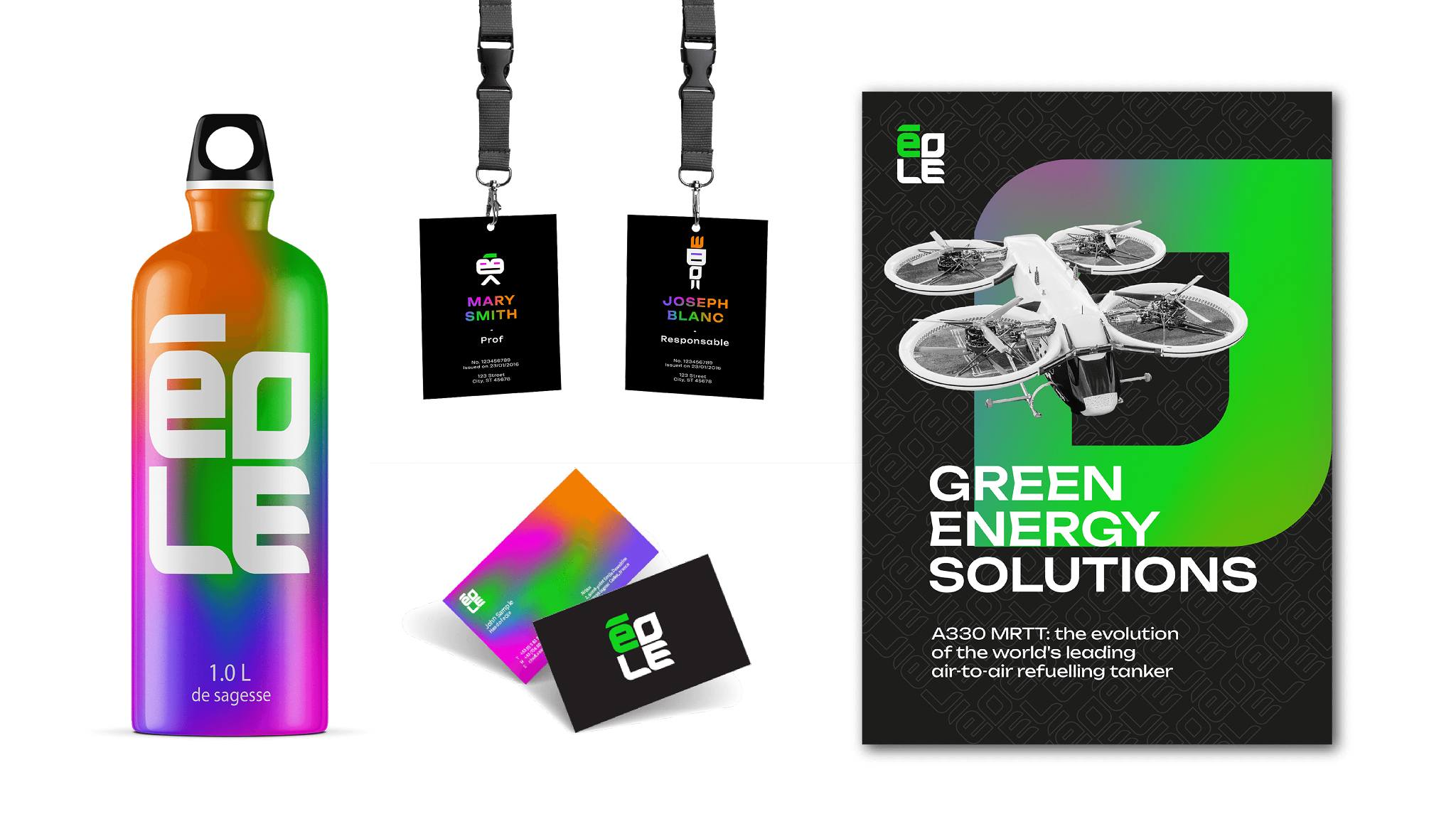
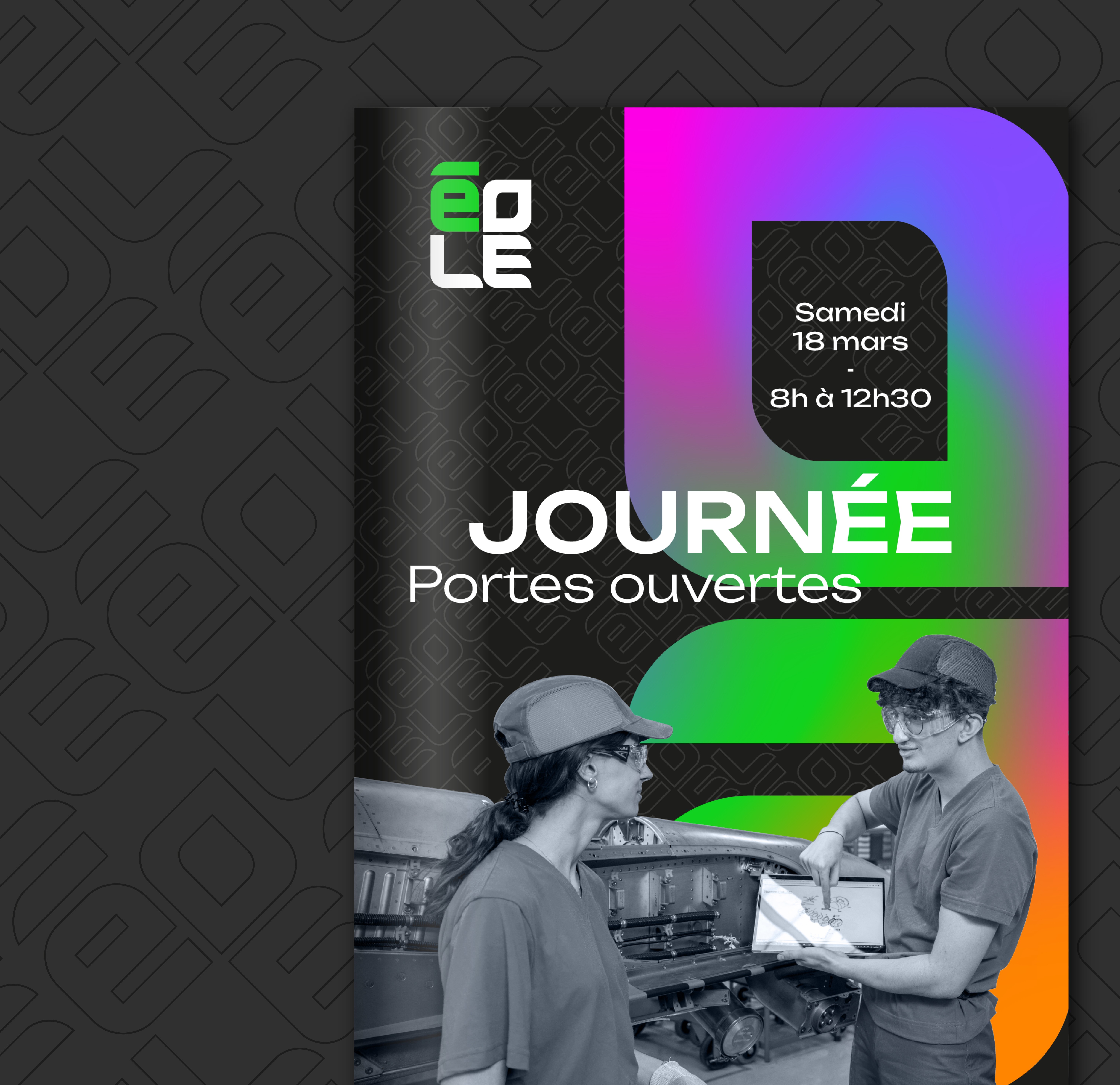
I created a distinctive and memorable brand identity that speaks the visual language of Gen Z while standing out from traditional schools and colleges.
My role
Worked as a Brand Designer in the Airbus Brand Department.
Responsabilities:
Proposing multiple logo and branding concepts.
Creating a logo with color variations for both light and dark backgrounds.
Developing a brand asset library, including colors, patterns, typography, and visual guidelines.
Year
2024
Duration
2 months
Tags
Branding
Redesign
Aeronautics
Education
Process
Research & Ideas exploration
I analyzed the market and recently launched schools in the aerospace sector and other industries. I also explored the associations linked to the new name and its etymology (Éole, the Greek god of wind), as well as potential mascot ideas and Gen Z design trends.

Branding
Designed a square wordmark logo that is highly legible and easy to use across all types of media, including print, digital, and large-scale applications such as the college building.

Chose four vibrant colors that can be used separately—for example, to distinguish different specializations within the college—or combined in a gradient. The logo can also be arranged into a pattern and used as a decorative background texture. I also created three characters for use across communications, adding a playful Gen Z touch.